
Happy New Year and welcome back to the Open Data Hub! To kick off our blog posts for 2021 we’re showcasing some of the interesting and diverse ways in which our open data is being used by various groups including app developers, researchers, and some clever individuals.
First up we have a couple of data visualisations. Open Data Forum user Thomas Ingham created the NSW Transport COVID-19 Impact Dashboard, which combines Opal Tap-On/Tap-Off data from NSW Trains, Ferries, Buses, Light Rail & Metro.
About the interactive dashboard, Thomas said “We use this data to compare public transport utilisation year over year (2020 vs 2019). The aim is to understand the impact of COVID-19 on passenger levels across all modes of public transport, using 2019 as our baseline.”
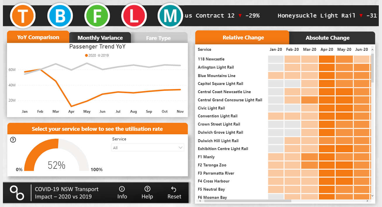
Thomas’s company, AcuityBI, builds reports with PowerBI just like the NSW Transport COVID-19 Impact dashboard. You can learn more on the AcuityBI website or AcuityBI LinkedIn page.
Next up is BusIntelligence, a solution developed by Thomas Yuan, Martin Green and Galvin Gunawan, which won the first place prize in their event at the Microsoft & SAP APJ Hackathon. The hackathon, held in 2020, was aimed at building solutions to benefit communities in a post-pandemic world.
BusIntelligence is an analytic solution featuring TfNSW’s real-time bus open data as sample source data, using Microsoft Azure and SAP Cloud Platform. It includes a statistics dashboard, which is home to data visualisations such as the Daily Performance Analysis (pictured), a Schedule Overview, and a real-time bus tracker.
“The solution, being a prototype, should help policy makers, operators, town planners and even the general public to better understand public transport access.”
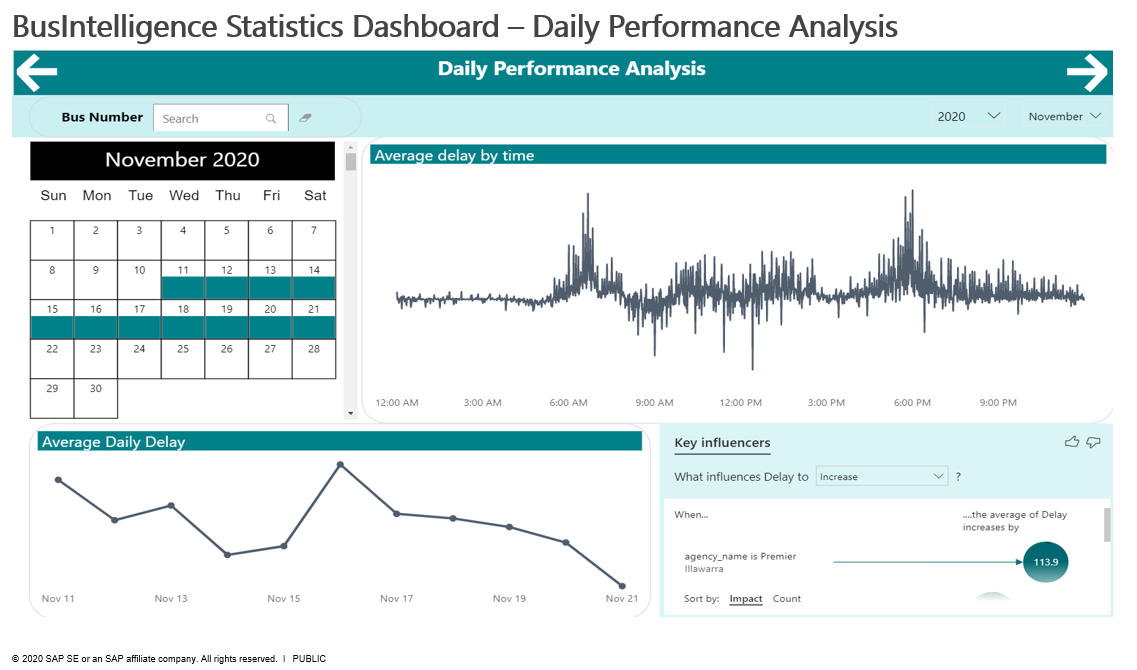
“I feel quite lucky that we picked TfNSW data as a starting point, particularly at the stage when we wanted to showcase how to quickly adapt for a different Agency: it was not easy to find another data set with the same completeness and quality!” Thomas said. You can view a demo of their solution on YouTube.
The next featured application of our open data is by Mathew Hounsell, Senior Research Consultant at the UTS Institute for Sustainable Futures, who has created a Barrier Counts Dashboard for 2004-2018. It features 9 different data visualisations that can be filtered by time of day, region or line, year, and more.
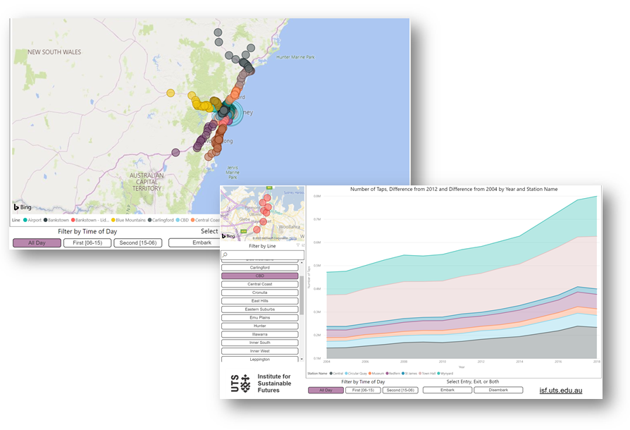
“This dashboard was developed to allow NSW residents & business to see the change in patronage at railway stations within the metropolitan area” Hounsell said. The dashboard is read-only, so you can play around with different filters and stations without worrying about breaking anything - simply refresh if you'd like to start your customisations again.
Next up we have Sam Leatherdale’s Train Board app!
Sam built this app primarily for his Smart TV and big screens, but it works on any screen like your desktop or laptop.
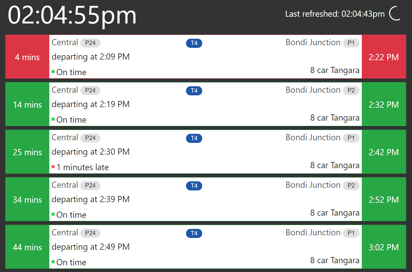
“My current use case is pre-programming in my morning commute, so that it shows my departure and arrival times on my TV as I'm getting ready for work. It uses the TFNSW trip planner and real-time APIs under the hood, so it shows indicators for running early/late.”
The app shows minutes until you need to leave on the left, and the time of arrival at your destination on the right. It features a customisable reminders box, and allows you to customise walking time in your journey as well as how many trips the app displays.
Sam has made Train Board fully open source, so you can download the code or simply head to https://trainboard.samleatherdale.com/ to access the app on your device!
The Inrix ParkMe web app is our next featured application, which helps its users find parking all over the world, and uses our Off-Street Parking API. While the app only shows off-street parking, it is filterable by amenities including EV charging, video monitoring, and more.
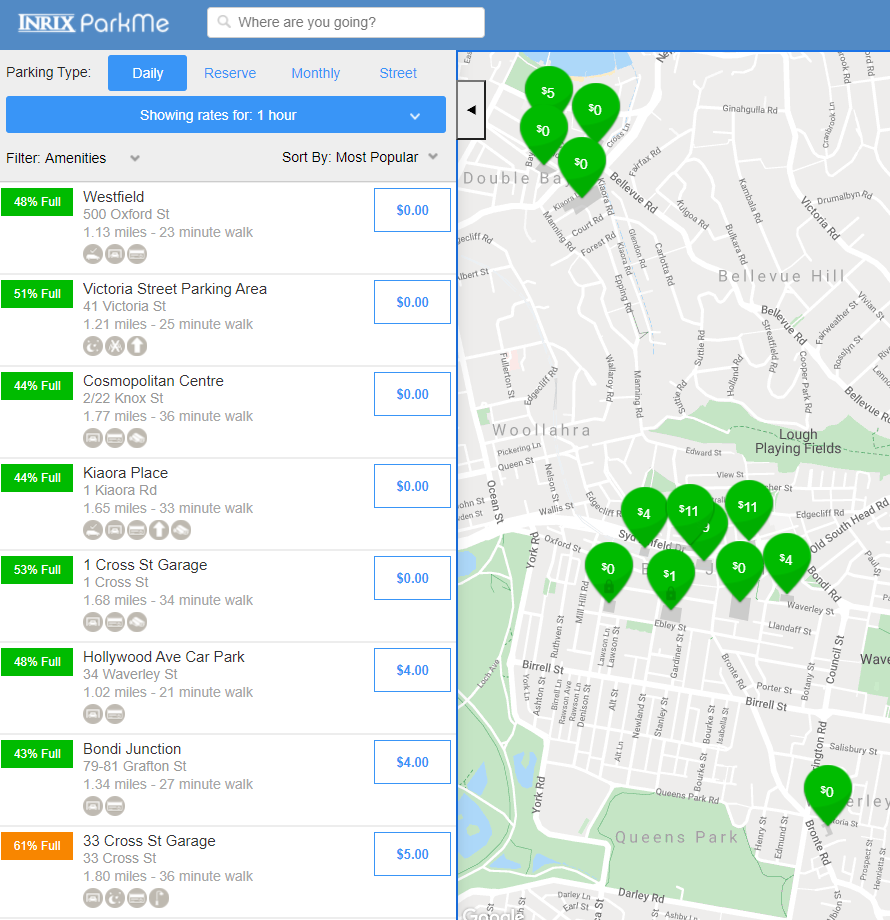
ParkMe also shows how far a walk each car park is from your selected destination, how full the car park is, and how much it will cost based on the duration of stay you select.
If you’re a user of public transport commuter car parks, then the PARKnRIDE app by Mohamed Abdelmoneam is for you! The app shows real-time car park occupacy details for Park&Ride car parks at Sydney Norwest Metro Station, Ashfield, Kogarah, Manly Vale and Seven Hills stations.

The app is available on both iOS and Android, displaying the location of many commuter car parks at train and metro stations, as well as one-click navigation to your selected car park on iPhone. You can download the app via the Apple App Store or Google Play store.
Next we have the Waverley Transport app, developed by Smart Cities Transport, which is a “hyperlocal Mobility-as-a-Service solution for customers to have a seamless travel experience.”
The app has been configured specifically for Waverley Council, aimed at easing traffic congestion and reducing parking demand through a range of journey options including shared vehicles and the use of Waverley Council’s new PUDO bays.
It uses our Public Transport - Real-time Trip Update, Public Transport - Timetables - For Realtime and other datasets such as Waverley Council Datasets.
Smart Cities Transport can white-label the app and tailor it for local councils and other smaller areas, highlighting hyperlocal features relevant to each community. Download it via the Google Play Store or Apple App Store.
If you’ve ever seen a screen showing upcoming train services in a shopping centre, foyer or window display in NSW, chances are it uses our open data!
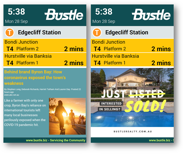
Bustle specialise in exactly these kinds of screens, showing real-time public transport information via our open data. They can be set up to display train, bus, and light rail departure times depending on the location of the screen.
Finally, we are showcasing research by Tong Zhang & Paul J. Burke, which used TfNSW open data in their paper, ‘The effect of fuel prices on traffic flows: Evidence from New South Wales’, which was published in Elsevier journal. The paper was aimed at investigating the relationship between gasoline prices and traffic flows in New South Wales, and uses data covering 2010-2017.
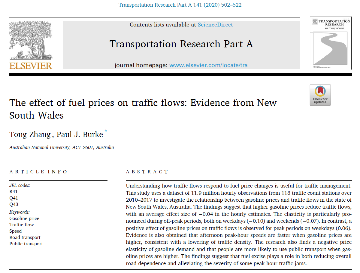
Their findings suggest that higher gasoline prices reduce traffic flows, and found that people are more likely to use public transport when gasoline prices are higher.
“We have obtained some really interesting findings using the data from TfNSW… Thank you very much to TfNSW for the data!” Zhang said.
Want to see more? The Open Data Hub is home to our community showcase, which features a number of apps that consume our open data. In addition, you can view our Endorsed Apps page and Endorsed App Infographics to learn about TfNSW endorsed apps.
We’ll be sharing these use cases in regular blog posts, so if you’ve already created something cool with our open data that you’d like to be featured, you can post it in our Brag forum category, tweet it to us, or send us an email!